Posted by Osvaldo
October 27, 2019
Attention conservation notice: a few hundred words on something that could have been summarized in just the figure plus a number (in other words, a tweet).
Background
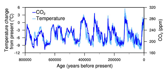
Very recently, this image appeared on my Linkedin feed, posted by a former colleague of mine (the caption is taken from the file name).

Temperature change and carbon dioxide change measured from the EPICA Dome C ice core in Antarctica
With just a few words to accompany it, the point being that one has to look at the right time scale to gain perspective, the interpretation was left to the reader.
So, if the world, as it seems, has already experienced an increase in both CO2 and temperature levels over the hundreds of thousands of years, why bother?
The link is authentic. The image is really hosted by the National Oceanic and Atmospheric Administration, scientific agency of the US government. EPICA is (was) a big European project to drill ice core in Antarctica and study climate in the past.
A reverse image search finds the image here. Nothing suspicious.
…right?
Except that, the current CO2 concentration is not below 300 ppm as the figure would imply. It went above this level already in the 50’s, and it is now over 410 ppm (412, as of today), and rising (from the NASA website, data from NOAA).
So, whoever wants to make the point that it’s not so bad after all, should at least keep in mind that the very last part of that graph has been cut. At least.
Photo by Samuel Ferrara on Unsplash